If you didn’t notice yet, check it out – we completely redesigned the site. From the ground up. Boy was it a lot of work.
But why should you care if we redesigned TheAbundantArtist.com?
I’m going to take you on a little behind the scenes tour of what we did – and why we did it.
As I was getting feedback from a few friends last week, they were asking me questions like:
- Why do you have a gigantic opt-in box on the home page?
- Why do you have that “Start Here” link in your menu?
- What’s with the funky paint logos?
- I thought you told us not to use black in our background?
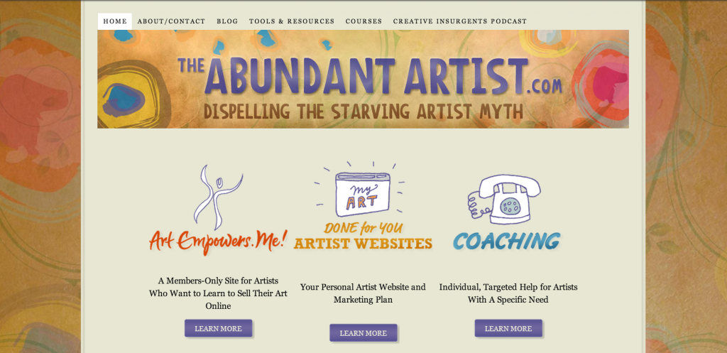
Here’s the site as of a few days ago:

A few thoughts on why this needed to change:
- Almost nobody was purchasing any of these offerings from the home page buttons. Something like 80% of my business happens from people opening and clicking on my emails, which takes them to a sales page.
- That logo is too large. Seriously. Why was my ego ever that big? Though I do kinda miss “The Starving Artist is a Myth” – I might add that back in to the header. Thoughts?
- The cartooney logos don’t really reflect the ideal audience that I’m trying to reach – the professional who is steeped in the world of Fine Art. The new logo, icons and color scheme are much more closely aligned with the artists I work with.
- It doesn’t look good on smartphones, and about 40% of my website traffic is from mobile devices. EDIT: the new site has a bug on some phones that is cutting off the top element in mobile phones. I’m working on that.
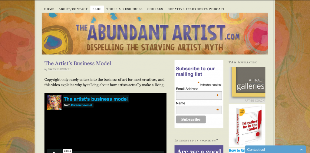
Then take a look at this old blog page:

There’s way too much going on here. Blog post, email opt-in, ads for other products that take people off of my page. We simplified it to be just the email opt-in and coaching offer in a single column. Fewer distractions – at least, that’s the goal. We’ll see what happens.
The biggest changes to the site, however, were on the back end and in the information architecture. This may get a bit technical, so feel free to skip over it if you’re a web neophyte – but I know a number of TAA readers dabble in design as well as art, so for you…
We ditched the old membership management software (S2Member) and went with a more robust solution (Wishlist Member). There were a handful of reasons, but mostly it came down to the fact that S2Member would frequently seize up and block people from logging in to the site until I reset the brute force trap (this happened even with the brute force trap turned off), and the fact that Wishlist has very solid integrations with a number of other plugins that I’ll be implementing in the near future (like Infusionsoft).
When we did the previous design for TAA, I only had two service offerings: websites, and coaching. That was nearly three years ago. Since then, we’ve added not only hundreds of new blog posts in a variety of topics, but also four new self-study courses. It was becoming difficult to know where to put everything, and most of the content wasn’t being discovered by readers, so we had to figure out a way to make all of the site content more discoverable. This was a mistake on my part, as I should have been thinking about this as we went along, but by the time I realized the problem, it was time for a complete overhaul.
Note to artists: as you add more content to your site, always consider how to make all of your content easily found by site visitors.
How you can redesign your site
First off, avoid a wholesale redesign if you can. This one took me six months to get out the door. From the time I started talking to designers to actually getting it deployed. Make small adjustments along the way, and you’ll save yourself a lot of heartache later.
Second, if you are just getting started as an artist, I think it’s more important to get a site up and running than it is to have a perfect website. The perfect is the enemy of the done. Using an artist website company like FASO, Squarespace, or Wix are great options until you get to a certain point in your career.
If you are an artist that is selling regularly online and you have reached a point where you think you need a new website, here are my recommendations to you:
Use a professional designer. Seriously. This will save you so much time. You may have a great visual eye, but the professional web designer has been doing this far longer than you. I hired Mika Rane because she was a friend and I liked her work. The best designers will be the ones that come from your personal network that you feel comfortable working with, because that designer is going to make a huge impact on your brand.
Pick a framework/theme that is forward compatible. There are a LOT of artist website options out there. Most of them are locked down systems that do not adapt well to modern design and technology changes. I would recommend using an open source system like WordPress because it has a huge community of people developing for it.
Use a professional developer. That pretty design your design person made for you? You’ll need to hire a developer to put it into place. They’ll need to put all of the colors, images, and design elements into your website and make sure the back end administration functions correctly. Don’t try to do this yourself. You need to focus on your art business.
Consider the costs. You should expect to pay $2000 – $4000 USD for the design alone. Then probably another $2000 for the implementation. You can mitigate some of these costs if necessary. Start by doing a lot of research on your own to get a clear idea of what you want. Sketch out what you think your site should look like and have the designer fill in the details. If you can’t afford to hire a professional designer to work from the ground up, then you can at least get a logo and color scheme from a site like 99Designs.com. You can also hire a developer on elance.com to do the coding for under $500.
Check out the Artist Website Checklist. Here’s a free download that I put together that will show you how to prepare yourself for a website redesign, and if you need even more help, or you’re just getting started on your first website, here’s a link to a webinar we did on the checklist.
Content Marketing Course coming up
 Back in February we launched a course on how to effectively market yourself online as an artist. The course just ended two weeks ago, and we’ve already had six artists land sales online – some of them multiple sales. We’re releasing the recordings soon, so stay tuned for that. I’m just getting the transcripts uploaded and the redesign business out of the way.
Any questions? Let me know in the comments.
Thank you for all of your help and insights Cory. I am going through this process myself and it’s a bit daunting. First of all, I had everything looking pretty with a free WordPress.com file just to find out that to run the WooCommerce extension I had to have a WordPress.org site on another host and a theme that was compatible with WooCommerce. Decided on the Canvas theme.
I then moved my site and set it up as a sub-domain of another site I host to save some money. Yikkes!!! This caused me numerous days with the hosting helpdesk trying to figure out why the Nav bar displayed the parent domain to no avail. One more move to it’s own host and … things are looking much better. I have just hired a web designer to do the e-commerce part primarily because I would like to paint again some-time soon. By the way, even though you hire a web guy, you are still the one who has to pull together all of the images, descriptions, sizes, weights for shipping …etc.
But you have inspired me and I am moving forward. I’m loving your interviews. Thank you so much, Joy
Thanks Joy – yes, it’s a lot of work, and there are a lot of mistakes to be made. Onward!
Hello Cory,
Congratulations on your new website, it looks good, clearer and professional.
All the best,
John
Thanks John!
Congrats on the new design, partner! And thanks for the peek behind the scenes.
For those who are daunted by the prospect of spending thousands of dollars, I will submit that it *is* possible to do it yourself nowadays, using a really good theme. But you’ve got to have a bit of a geek side to you, or some really good technical helpers (and ideally both!) otherwise you will drive yourself crazy…
The other thing I’ll add is that a website is ALWAYS a work in progress. Always. Always. Always. So get used to tweaking it. The more comfortable you can get with your own site, the better, even if you hire people to do a full-on site design and implementation for you.
I would add: If you decide to design your site yourself, you may find out (like I did) that you really like it.
Before I knew it, I was designing websites for other people, and then getting paid for web design more than for my art.
It’s a nice side-effect.
Thanks for the insight into your membership management system, Cory. I’ve done some work with InfusionSoft, I think it’s a perfect match for what you’ve got going on.
The new site looks fantastic! Much more streamlined.
Thanks Caelan. I’m looking forward to the InfusionSoft integration. 😉
Hi Cory,
Great new website– all the best to you, and much success.
I appreciate all the e-mails, etc form you over the past number of months.
Cheers,
Kurtis
Great looking website, Cory. What a pleasure to navigate! I’m returning to it now.
Website look good before, but great now! Easy to navigate too. Well done!
Thanks Gunilla!
So excited to see the changes. I love the articles but then have a hard time finding them again. Thanks for talking the time to organize and make it easier for us users to utilize your service, especially for mobile devices. Good work!
Thanks Nelia. Better discoverability is what I was aiming for. 🙂