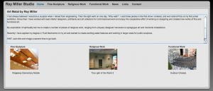
Two weeks ago, I posted 9 Great Artist Websites. The response to the post was great and I got a few questions asking me how they could do what these artists were doing. I asked, over on TAA’s Facebook page, if anyone would like me to review their website. Ray Miller was one of several brave souls who agreed to have his site reviewed in public. Here’s my feedback.
First Impressions
The site visitor’s reactions when they land on your site are very important. You want to make sure that a new visitor (and returning visitors) are met with a certain wow factor and a next step.
Call to Action. Ray’s site needs to invite the visitor to do something – I generally recommend that they invite the visitor to sign up for a mailing list or to take a look at a piece of art that is for sale. He should add a call to action to the home page.
Bigger & Better Photography. Ray’s work is actually outstanding. He’s won multiple awards and is an adjunct professor at a local school, but his photography is selling him short. He would be better served with one large, high quality image on his home page than several small images that make it difficult to see what’s happening.
Full or Flexible Width & Height. Ray’s site is currently a fixed width and height. I would recommend making it load a little more dynamically so that it can display larger on bigger screens, more effectively showing his photographs of his work.
Displaying Your Art
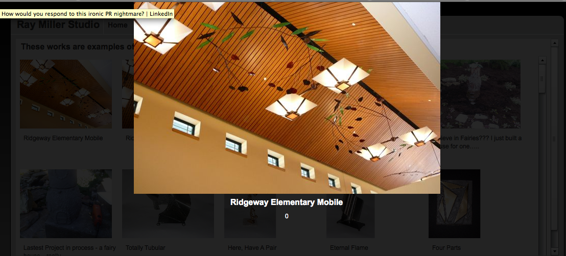
Image Galleries Are Tricky. Most fine art websites struggle to portray an artist’s work. While the pop-up lightbox that is shown in the above screen shot makes the image bigger and easier to see, Ray is missing the opportunity to create an image search optimized page with an introductory paragraph explaining where this work is, the background of its creation, and pricing for similar pieces.
Speed Matters. The gallery page has an exceptionally slow load time, which is not only a bad experience for the user, but can also cause search engines to drop your page from the listings.
Frames Are for Art, not Websites. You can’t see it very well in the above picture, but Ray uses frames throughout the site. Besides some technical issues with search engines that some types of frames cause, frames have generally fallen out of favor as a way to display large amounts of content. They needlessly take up screen real estate and they often cause confusion when scrolling.
Updated Content
Awards & Shows. Ray’s got the right idea with a News section, but he should keep it updated, with dates and times of when his awards were given. Also, the entries are cut short with elipses […]. These should either be links to where they originated, or be taken off of the page.
Show Your Visual Appeal. Artists are generally visually oriented, and people want to see that the artist has vision. It should extend into every area of their display. Often times I will see artists go to great lengths to frame, light, and otherwise display their creations, but then o the web they don’t put as much thought into it. Make your News & Contact pages interesting too!
As you can see, having a great art website can require a great deal of thought and work. I always recommend hiring a professional web designer to build a site for you, but if you can’t afford that, then you should do lots of research and steal from learn from the best.
What do you think – does any of this help you with your website? Are there any other areas where Ray might improve?


Kudos to Ray for volunteering for a public review of his website! I agree with all of the suggestions made.
I would also suggest Ray think about WHO is website is for (target market) and what he wants them to DO when they arrive on his website. For example, he touches on this a bit in the intro on the home page, but it is not totally obvious. Consider replacing the intro text with a clear, bold statement such as “I collaborate with interior designers, architects and art collectors for commissioned work to design and create new works of fine and functional art.” Perhaps briefly describe the types of projects you are looking to work on (with large images of select, related previous projects). Then have a call to action such as calling or sending an email to explore the possibility of working together.
The other info on the home page (with all of the “I” statements which are more about the artist and less about the visitor) could be moved to a separate “about” page.
Ray could also sign up for free google analytics and install it on his website so he could start tracking his website visitors and see what they are most interested in.