What makes a great artist eCommerce shop? Although awesome art is a great start, if your shop is hard to find, hard to navigate, and difficult to buy from, even the most beautiful art will languish unpurchased. We took a look at the shops of a few of our favorite artist websites to find out what they’re doing well, and how you can emulate them with our own eCommerce shop. There are examples here of shops running on both Squarespace and WordPress. Regardless of the platform you use, the principles of what makes a great shop are the same.
So what makes an artist eCommerce shop effective?
The site is easy to navigate. An interested customer should be able to figure out what you have for sale and how to purchase from you in 1-2 clicks. If your potential collector has to do too much work, they’re unlikely to make a purchase, even if they really like your stuff. The best artist ecommerce shops are easy to navigate and incredibly easy to buy from.
The branding is cohesive. The colors and fonts are consistent, and communicate a vision or evoke an intentional feeling that is consistent with the artist’s message or vision. (Some great examples of this below!)
The appearance is professional. Your art shop doesn’t have to be stuffy or plain, but it should be professional. Your images should be clear and sharp with links that work. All pages should have up-to-date information.
Top artist ecommerce shops
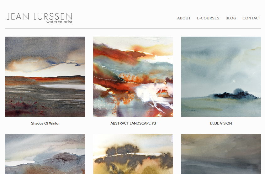
Jean Lurssen (Squarespace)
Jean Lurssen’s website homepage very clearly shows what kind of art is available, and the homepage doubles as gallery/shop. The instant the front page loads, you can see what is available and it’s fairly clear that the work is for sale (though you have to click through for pricing).
Takeaway: The site has a white background with minimal animation and a simple font that keeps your attention focused on the most important thing: the art.
Amira Rahim (Shopify)
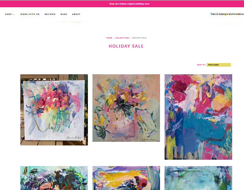
Amira Rahim’s site is an example of very solid branding. Her work is vibrant and colorful; a bright magenta plays a starring role in many pieces, and her logo, website header and header text reflects it. Multiple categories appear when you hover over Shop including Originals, Prints, and Recently Sold Works. When hovered over, each image in the shopshows the title, the medium and size, and the price. This is a very user friendly feature, because you don’t have to click over to a new page every time you want to see the price or the name of the piece.
Takeaway: Ease of navigation is key.
Emily Jeffords (Squarespace)
Emily Jeffords’ site features multiple shop tabs at the top including art gifts, originals, and prints. This is helpful for both customers who are just browsing and those who know exactly what they want. You don’t need to sift through tons of art you aren’t interested in purchasing. The site features a responsive design; hovering over an image shows an alternate perspective of each piece. The price is shown under each piece, so there is no clicking or even mouse hovering necessary. Clicking through to a piece shows a high quantity of images including the piece hanging on a wall, as well as closeups and views from different angles.
Takeaway: Providing as much visual information as possible to your potential collectors about the piece helps increase their confidence in buying.
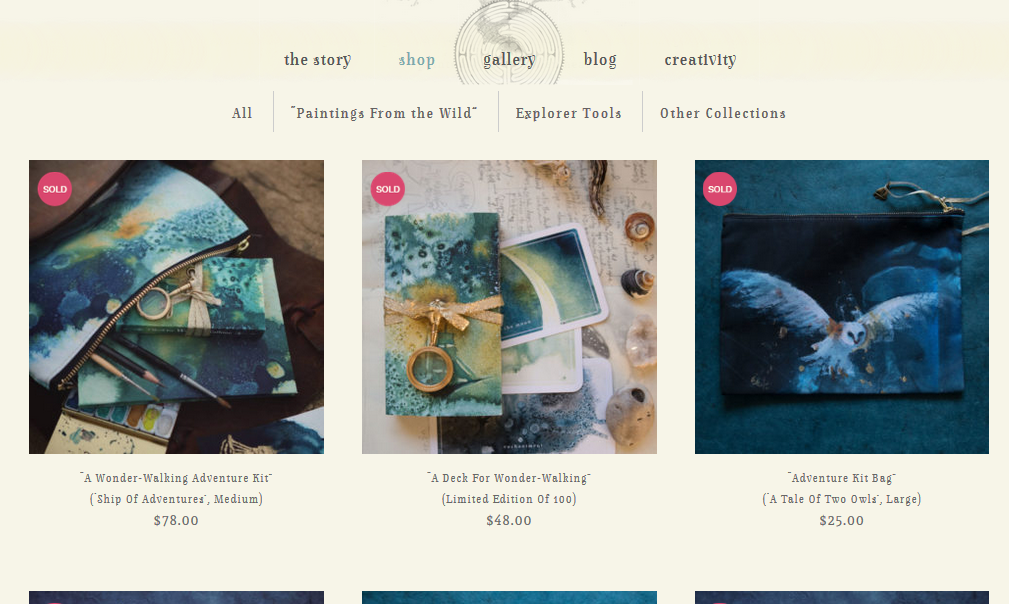
Amy Twon (WordPress)
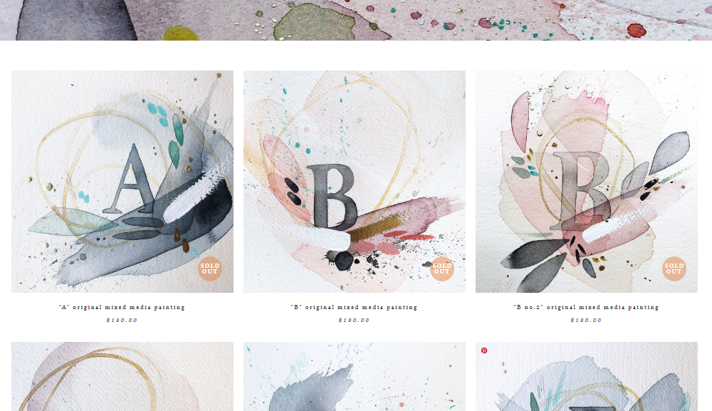
Amy Twon leaves images of work that has already sold up in her shop with an icon indicating that they’re spoken for. This is a really effective strategy for invoking a sense of scarcity and fear of missing out in potential collectors without being dramatic.
Takeaway: Showing that you’ve sold many pieces already inspires confidence in your buyers.
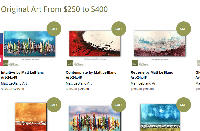
Matt LeBlanc (Shopify)
Matt LeBlanc sells art at a wide range of price points for every type of collector, so when you mouse over “Shop Originals” you can choose the price range you’d like to see. There is also a separate tab for accessories. Items on sale are marked, and items that are sold out are also marked- which as mentioned above, increases the sense of scarcity. The prices are shown beneath each image, and when an item is on sale the price is slashed to indicate what a good deal the buyer is getting.
Takeaway: Drawing attention to sale prices and making it easy for customers on a budget to enjoy your work is a good sales strategy once your business is established.
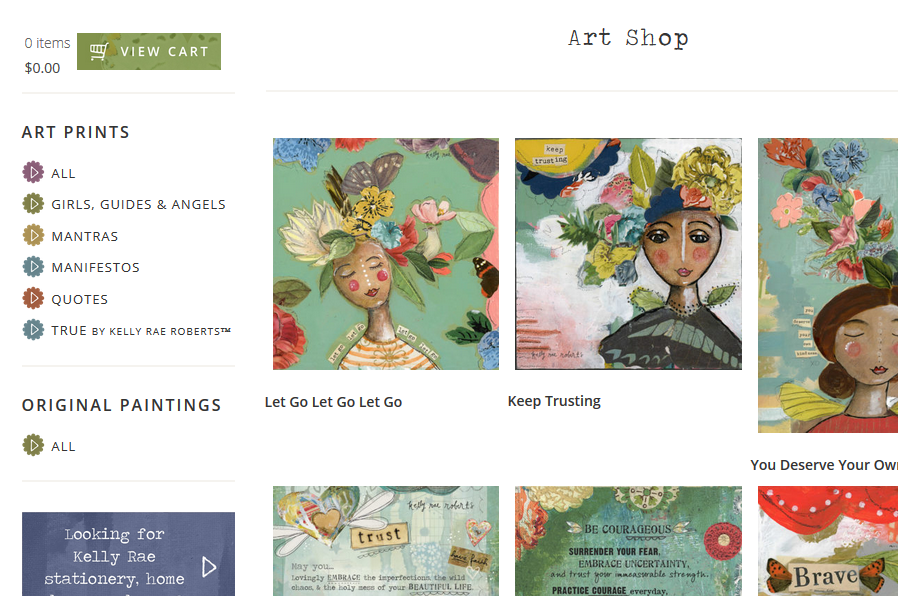
Kelly Rae Roberts (Divi for WordPress)
Kelly Rae Roberts is another artist whose website branding is on point. You can tell instantly what kind of art to expect from her before ever clicking on her shop page. On the left of the inventory is a menu where you can narrow your search by type. Clicking through shows a description of the piece and a drop-down menu where you can choose your print size and see the corresponding price. Kelly Rae also specifies in bold print that all shipping is always $7.
Takeaway: The combination of professional search functions and ease of navigation with a unique and memorable design ensures an enjoyable shopping experience.
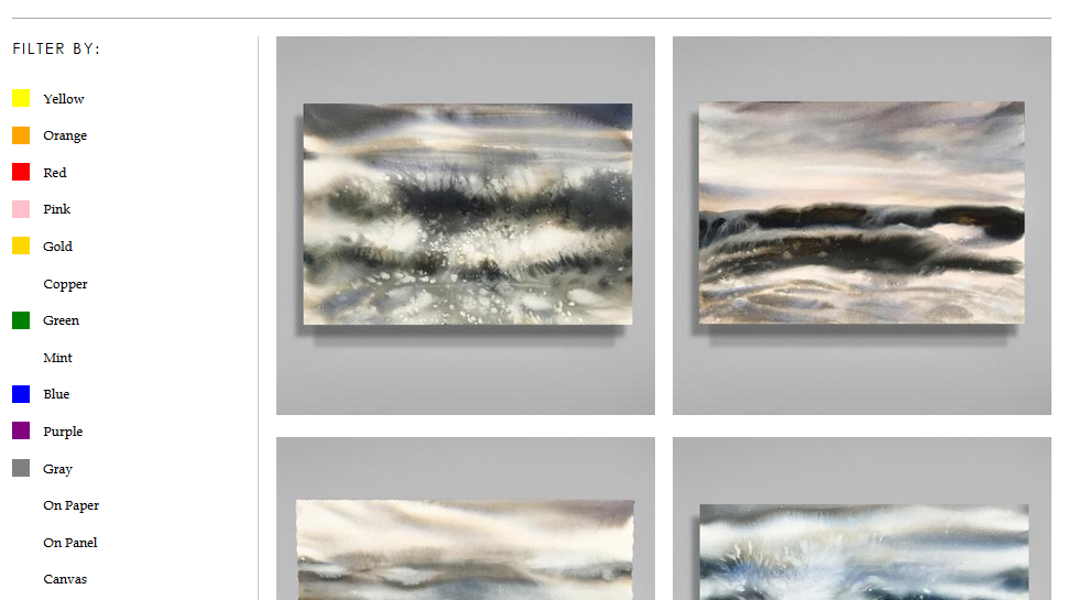
Marta Spendowska (Shopify)
Like many of the other shops on this list, products for sale are separated into originals, prints, and art gifts. You can then filter your search on the sidebar by color, product type, or collection which makes it easy to find exactly what you’re looking for. Hovering over each piece provides the piece title and the price so you don’t need to click through unless you want to see more details. Clicking through provides more images as well as several tabs with more details including materials, inspiration, and shipping information.
Takeaway: The amount of information available about each piece is a thoughtful touch that shows a high level of interest in the customer’s satisfaction.
What do all of these shops have in common?
Each of the artist ecommerce shops in this list were included for their ease of navigating and purchasing, high level of professionalism, and careful branding and attention to detail. Your website doesn’t have to be ultra-slick with fancy responsive images and background videos, but the design and features should make it clear that you care about the customer’s experience and that you really do want to make the sale. If your ecommerce shop is thoughtfully designed, customers can focus less on trying to figure out how to make a purchase and more on which piece they want to buy first!
What do you think makes a great ecommerce shop? Let us know what’s important to you in the comments!
Interesting lists! I especially loved the work and style of Kelly Rae Roberts.
Interesting points, Thanks